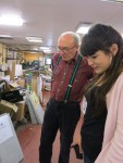
Jess and me spent a couple of really interesting hours with Jim Pennington from Lithosphere printers in North London (www.lithosphere.co.uk). We went originally with a view to just meet and greet another printer, find out what they could do and add them to the list of people we could possibly work with in the future.
In the end we got a lot more. Jim sat us down, made us some tea and told us all about the kind of things printers have to consider and the issues they face when they are working with designers.
One story he told was that designers, with long print runs, should always check work that has been printed overnight with work that has been printed during the day. That’s because the printer working the night shift will be working in very different light conditions to the person on the day shift – something which can affect colour consistency. A good printer will look out for this sort of thing for you.
I’d heard of Lithosphere because they printed the Stop The War posters, designed originally by David Gentleman (see can see the youtube video about how Gentleman designed these here).
They only do a certain amount of printing in-house and will send out some jobs to out-of-London printers that they know are right for the job. They get trade rates for these jobs (which are cheaper because they are not in London). Lithosphere add the value in talking to you about what to consider with regards the paper you are considering, the kind of colours you want to use, etc. He made the point that they can add the most value when people contact them at the beginning of a job when they are considering things like paper and structure. They know GF Smith paper suppliers – but rather than the client buying the paper, Lithosphere buy it.
They don’t handle small jobs for less than £200 but I will definitely try and use them where I can in the future because I know I’ll get real advice based on what’s right for the job.
Jim actually went to LCP back in the day. Small world.
-
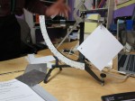
- small scales for weighing paper
-
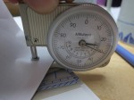
- measuring paper thickness (in microns)
-
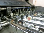
- heidelberg 4 colour offset printer in action
-
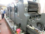
- heidelberg offset printer
-

- Jim explaining a print job
-
- plates for the offset printer
-
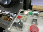
- offset printer controls
-
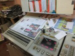
- proofing desk and printer controls
-
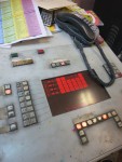
- for calibrating printer colours + plate positions
-

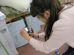
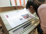
- checking detail through linen glass