Category Archives: Street

Gold Snow

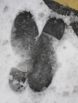
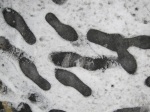
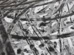
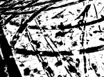
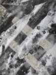
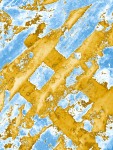
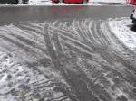
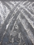
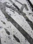
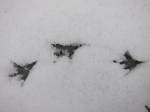
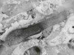
Random snow stuff, really. Started with thinking about black and white (visual grammar) compositions using rough edged snow against the dark tarmac. This soon started to include everyday objects with very distinct, often secondary forms (shoe prints, tyre tracks). For my academic contexts piece, I’m thinking about something to do with how rough/natural/accidental/worn forms can combine/coincide with forms which are very deliberate/’straight’ and this sort of fits with that. A bit.

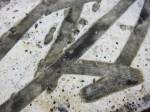
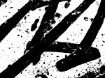
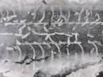
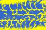
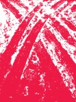
Played with a few in photoshop, just to see what impact texture and colour could have and get to know the software a bit better.  Anything I’ve done is pretty much through the ADJUSTMENTS tab (either the thresholds or gradient map controls).

I didn’t spend a lot of time altering the images (finding the best colours, cropping, etc) but it has given me some ideas for how textures like this could be used in wider design pieces – poster background, logo elements, etc. In its altered form, the snow can look like anything from a virus under a microscope, to calligraphy or marbled paper.

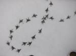
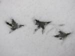
My favourite are the birds’ feet which look like they could be made into a wall paper border. Funnily, each foot looks like a bird or an aeroplane.

Click on the one of the images and it becomes a slide show (apparently).
 

A trifling thing

Not a great photo so difficult to tell the whole story visually, but came across some badly painted double yellow lines this morning. Difficult not to read on, isn’t it?

Even though there was only a small diversion from their usual strictly uniform and parallel route, in that short distance the silent authority of the double yellows was lost and suddenly they became two uncoordinated marks, each with their own slightly all over the place personalities.

There is also a practical element to this breakdown in visual authority: my driving instructor used to tell me that when you park on double yellows that have been badly painted, if you take a photo of them, you will be let off any related parking fine. The argument goes that if they’re not as you expect them to be, then  you can argue their meaning wasn’t clear to you.

From a different angle, a quick google search reveals some examples of how attractive the lines can look. There are two really nice examples from photographer Jess Hurd of yellow lines as decoration to unusually shaped bits of road.

The way to go

This video by Hirst, Crickmore and Durose tells the story of the UK system of road signs and the contribution made by two designers, Margaret Calvert and Jock Kinneir between 1957 and 1967.

As a regular cyclist, I spend a lot of time being guided and protected by road signs. But in a funny way, I don’t really notice them; it’s only when there is a new feature, such as a new mark for the congestion zone or a nice blue stripe for a new cycle lane, that my proper awareness seems to wake-up to the other things decorating my route.

The video makes the point that this happens precisely because Calvert and Kinneir’s work was so good: information design is successful when we are able to derive significant meaning from it but without being distracted by it.

A more detailed account of Calvert and Kinneir’s work can be found on the Design Museum website, here.

Tagged